
Platform
Typography, colour and dark mode
Configure a consistent visual system for news, opinion, metadata, lists and dark reading.
Last updated 23 October 2026
Aeon News combines a fixed editorial structure with an extensive presentation layer for typography, colour and recurring components. Treat customisation as one design system rather than isolated choices.
Typography
Global controls cover body text, article category, topic, metadata, news labels, summaries, standfirsts, information boxes, latest news, secondary headings and several light and bold headline styles.
Define body text and the default headline first, then introduce specialist treatments for columns, culture or analysis. Test languages with long words before finalising the scale.
Colour system
Theme options include backgrounds, primary and secondary colours, links, trending accents, labels and comment areas. Maintain sufficient contrast and use accents sparingly so editorial hierarchy remains visible.
Dark mode
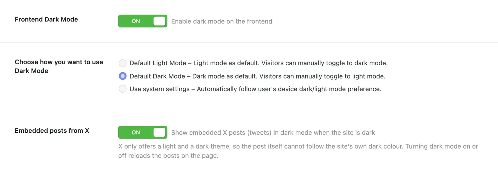
Dark mode is switched on under Aeon News Options › Dark Mode. It can default to light, dark or the reader’s system preference, and readers can switch it themselves. Custom dark CSS can complete a child theme’s brand. Test widgets, forms, adverts and logos; a white advert or a dark logo can otherwise become unreadable.
Embedded posts from X
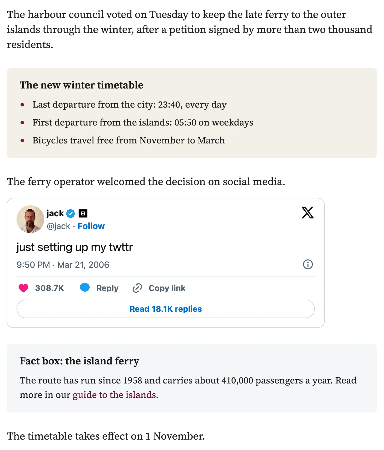
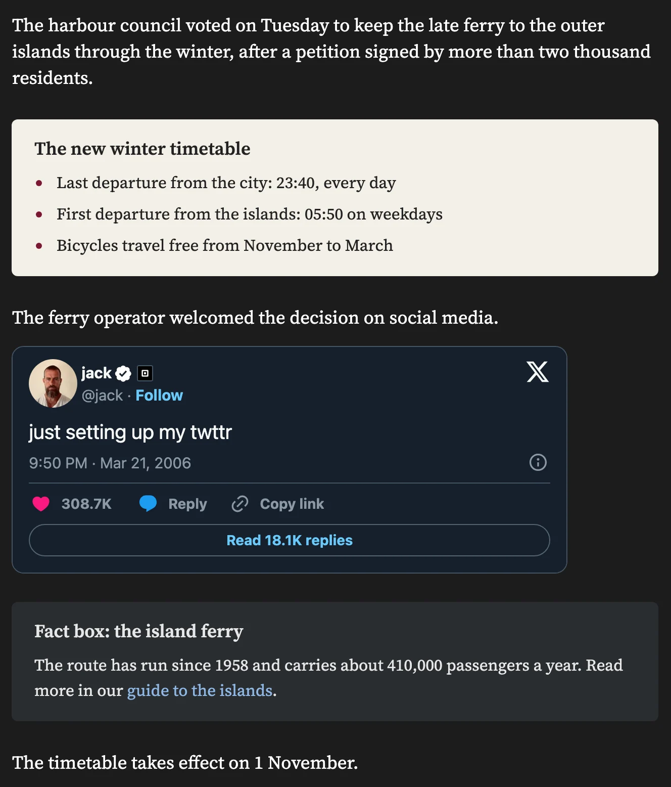
Newspapers embed posts from X (Twitter) often, and a bright white post in a dark article stands out. With Embedded posts from X switched on, embedded posts are shown in X’s dark theme while the site is dark, and in the light theme otherwise. When a reader switches between light and dark, the posts follow and are reloaded. The setting is off by default.
X offers only a light and a dark theme, so the post cannot take the site’s own dark colour. Its neutral dark grey suits every site.
Blocks with their own background
When an editor gives a block its own background colour, for example a light grey group with a timetable, that block keeps its light look in dark mode, with the site’s ordinary text and link colours. It reads as it does in the editor. Text colours the editor has chosen are kept, and Stackable cards and tabs work the same way.
The Box block style
For a box that should go dark together with the page, choose the block style Box on a Group block instead of a background colour. It is light grey in light mode and dark grey in dark mode, with readable links in both. A child theme can adjust its colours, spacing and corners.
Latest News and blockquotes have their own detailed visual controls. Because they recur often, small inconsistencies become prominent. Make changes in a test environment and review article, front page, category, author and mobile views.